Sovren · Design and product lead · Pay
I reversed a wallet from addresses to people, and four surfaces inherited it.
Pay is Sovren’s non-custodial wallet on mobile and web, and the rail every tip, order and payout in the ecosystem settles on. The version I inherited put a hexadecimal address where a person’s name belongs.
One in five hundred.
Under 0.2% of all users ever lost access to a seed phrase. The rest kept their keys.
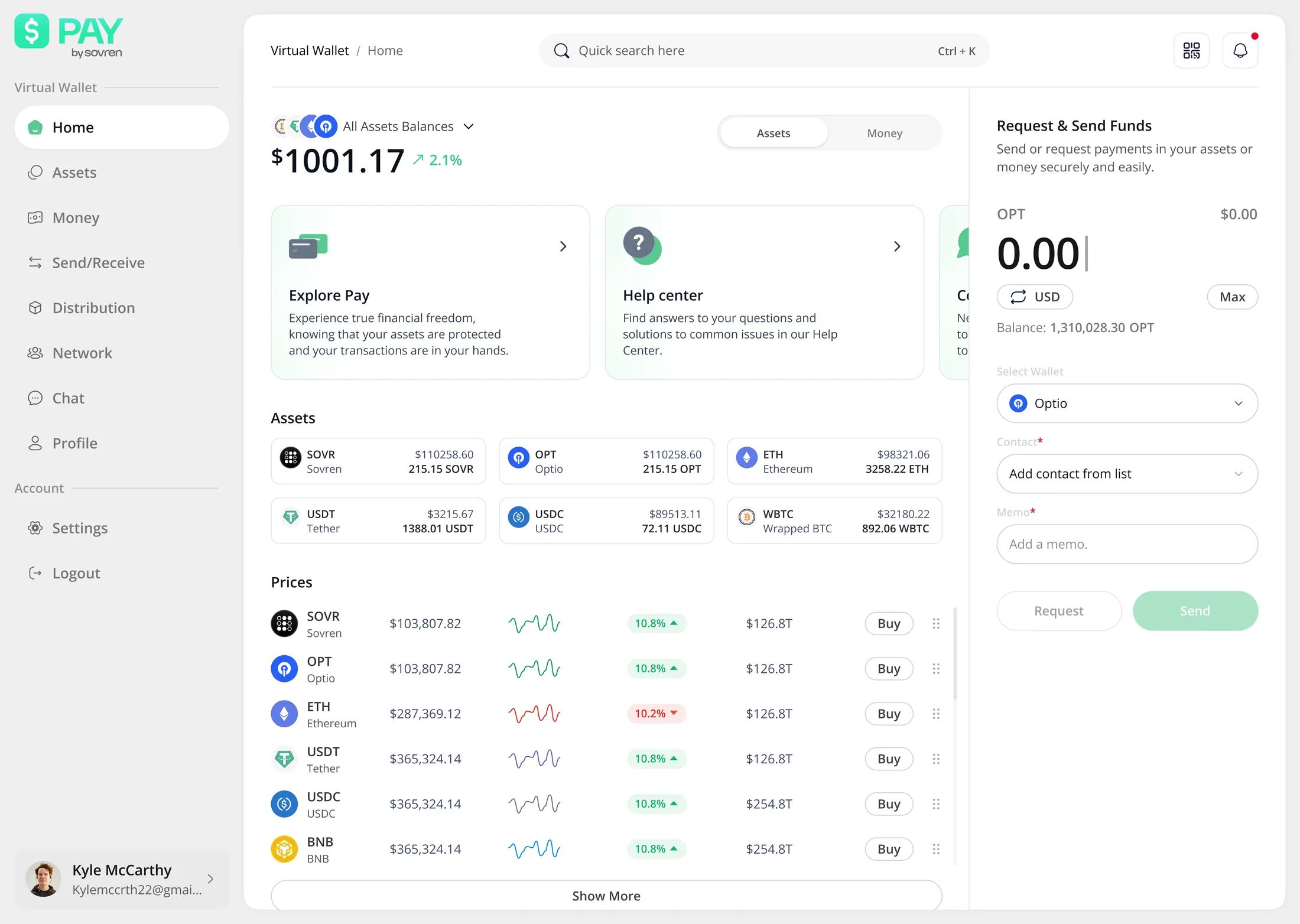
- 1One balance, in dollars, assets beneath it.
- 2Send and request are a panel, not a page.
- 3You pick a contact, not an address.
A wallet for people who had never held one, that people who had would not quit.
The objective was bigger than an app: unlock funding and partnerships for Sovren through blockchain and cryptocurrency, with a clear path to integrating fiat later. The product that had to carry it was a non-custodial wallet on the SOVR chain, mobile and web, shipped quickly. It had to be simple enough to be somebody’s first wallet, social rather than address-shaped, and embeddable, so other products in the ecosystem could carry money without rebuilding it.
That is two audiences who want opposite things, and the design problem is the gap between them. A first-time owner needs the vocabulary explained. Somebody who already holds keys will leave a product that explains it to them.
I interviewed both, and each one broke a different screen.
I ran more than thirty interviews, and separately sat with people from both groups through the wallets they already had. What came back was not two personalities, it was two different screens failing.
Sixty years old, an older phone, no crypto experience at all. “Seed phrase” is not a term she has ever met.
Onboarding assumed a vocabulary she did not have. A recovery phrase is handed over to keep safe before anything explains what it recovers, and a hexadecimal address is a wall she will not walk through.
Explanation at the point of confusion. A word that needs defining is defined inside the step that uses it, never in a help centre nobody opens. Onboarding continues by email after she has closed the app.
Reads the chain, verifies before sending, and will abandon a wallet that talks down to her.
A person-first send hides the address she wants to check with her own eyes. Hand-holding on every step reads as a toy.
The address path stayed, in full. The default moved and nothing was removed. Help is available rather than compulsory, which is the only version both people can use.
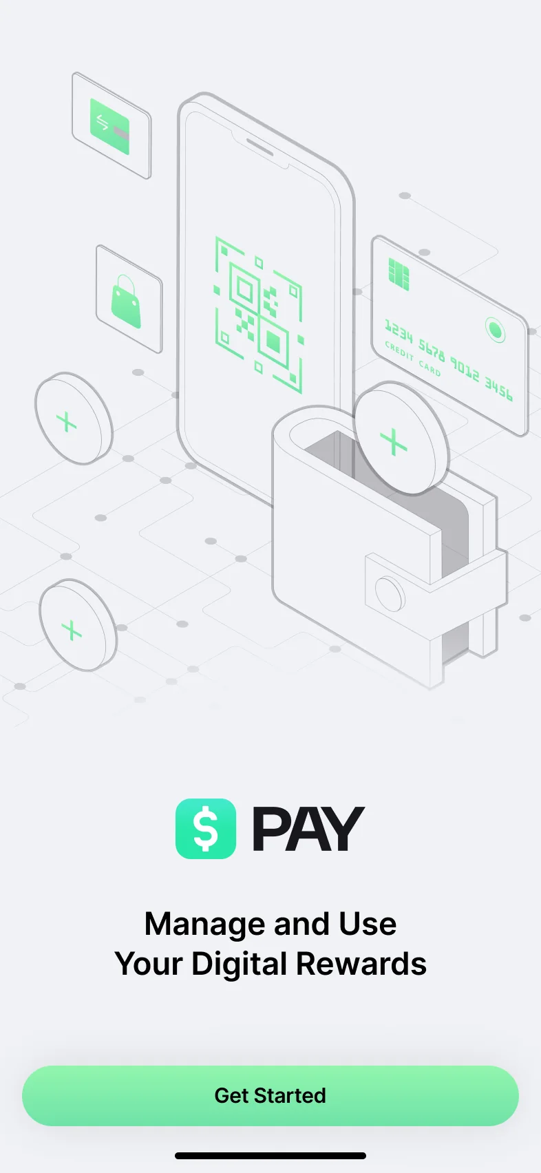
- 1The first screen names no wallet vocabulary at all.
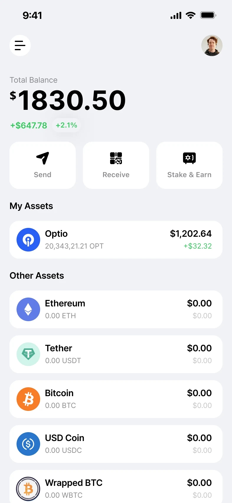
- 2What she lands in leads with dollars. Tokens sit underneath.
Under 0.2% of all users ever lost access to a forgotten seed phrase. In a non-custodial wallet, losing the phrase means losing the money with nobody to call, so that is the number the onboarding was built to move, and the one I would defend first.
I changed the recipient component, not the send screen.
Send identified the person you were paying by their hexadecimal address, and told you what you could spend as a token count. That is what a wallet looks like when the people who built the chain draw it. It is also what a form looks like to somebody afraid of getting it wrong.
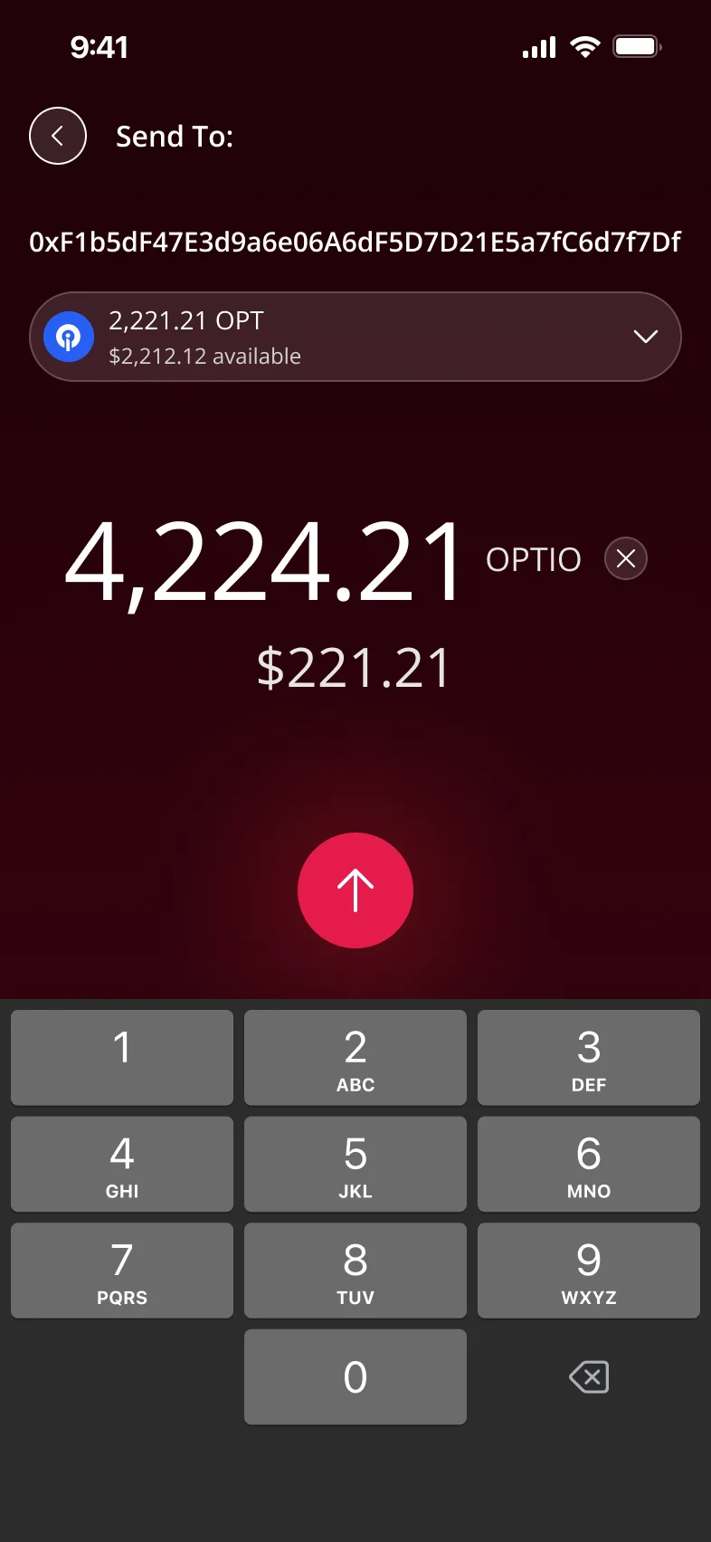
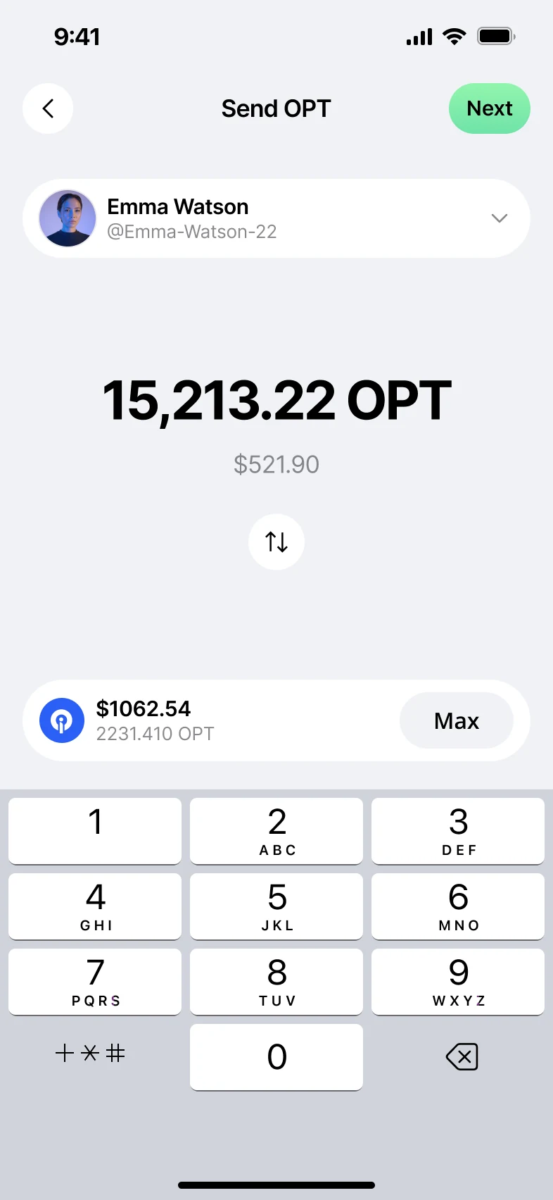
- 1Left, the address is the person. Right, the handle is.
- 2The spendable balance became a dollar figure and a Max.
- 3Both keep the keypad. What changed is the vocabulary.
The address did not disappear. On the review step in the rebuilt wallet, it sits beside the network, the fee and a warning that a send can’t be reversed.
- The walletInside the SDKSend, receive, confirm
- A live roomIts own platformTipping a creator
- A chat threadIts own platformPaying a person
- A storefrontIts own platformChecking out
Where the change happened is the part that matters. Address-first was a property of the recipient component, the shared piece inside the SDK, so reversing it once reversed a tip in a live room, a payment inside a chat thread and a storefront checkout. Each of those is its own platform, and embedding the wallet meant meeting every one on its own terms: its design system, its APIs, its account IDs and user information. I worked with each of those teams to land it. Designing the component was half the job; designing it to survive four platforms without breaking any of them was the other half.
The argument was not about taste. Address-first is precise, honest about what is actually happening, and what the users already there understood. Person-first is a bet on the people who had not arrived yet, made against the people who had. I made that call, and then spent the time it takes to land one: product, engineering, and the designers drawing the surfaces it reached.
Node hosting shipped without one new component.
Node hosting shipped on the components that already existed. Not one new component was drawn for it. It runs $40K MRR, and the design cost of that revenue was close to zero.
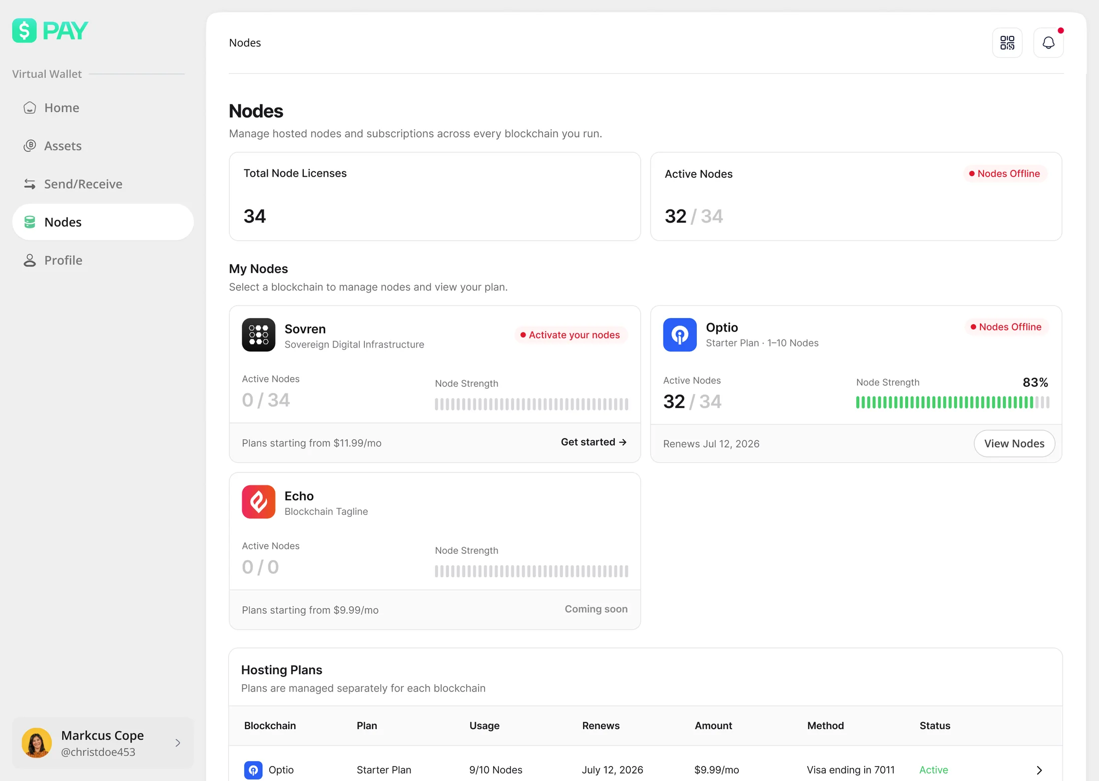
- 1Plans priced per chain, renewed monthly.
- 2What is running and what is offline, counted separately.
The components it shipped on, the rules they follow and the sixteen checks that hold them together are written up in full: the design system this site is built on, which is the same architecture, documented against its own gaps.
Peer-to-peer payments took the same route. They shipped in USDC and USDT. Fiat integration is in progress, and tap to pay with USDC is being added now.
Fifteen minutes was the wrong timeout for this wallet.
Security was the posture from the start, so the app signed people out after fifteen minutes of inactivity, the way a banking app does. It caused friction immediately, and it was worst for exactly the person section 02 is about, who moved slowest through every screen and got thrown out mid-task.
The reasoning was wrong in a specific way. No transaction happens without the Wallet Key. The session was never what stood between an attacker and the money, so a short timeout bought almost nothing and charged for it on every screen.
Desktop went to sixty minutes. Mobile stays signed in for thirty days, because the device carries its own lock and the Wallet Key still gates every movement of money.
In 2026 I rebuilt the wallet layer on Privy, Stripe’s wallet stack, in four weeks against a six-month estimate. Read the rebuild →